Search FontMaster

Showing posts with label freeware. Show all posts

Saturday, February 9, 2019

Amblin Mono Free Demo Font by Doug Peters

Amblin Mono Free Demo by Me

I have big designs on this font family. This is the personal use only freeware demo you can get now... 
https://w3n.us/amblinmono
I have to finish up the commercial use version of this, but I have a lot of irons in the fire right now, so please be patient. Of course, it would only take me a day and a half at the most to finish off the commercial version, document it, make a few intro/sample images, archive it and send it off, if anyone ever does donate. 
 
https://w3n.us/amblinmono
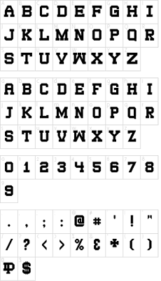
Amblin Mono is not just a monospaced sans font, it has collegiate and sports appeal. Because the demo has a limited character set, I am not allowing it to be used as a web font, but the commercial version will have a web font included.

Free for Personal Use Demo download is at Font-Journal...
https://w3n.us/amblinmono

Sunday, February 3, 2019

Free (CC0) Multilingual Constant Height Sans Block Font by JingYo

AZUL by JingYo

#Bold, #Condensed, Constant Height (exept accents), Block Filling #Sans #Font with a Modernized Art Deco Playbill look. 
 
https://w3n.us/azul
https://w3n.us/azul
 
CC0 PD #Free #Typeface with #Multilingual Support. 
 
It makes a fine font for a variety of needs, and although designed as art is quite legible and makes you slow down and read.  I think it looks good, I like it, or it wouldn't be here.  It will not fit everywhere, but it is a great font.  And free, and you can even modify it and create your own derivative if you want to take that route and tweak it or even redefine it and make it something else.
 
Note that you can use this one as a web font, too.  It has been released into the public domain as a freeware font that holds onto the authoring designer's Copyright, but you can pretty much do anything with it, and it's free!

Free for Commercial or Personal Use. Download from Font-Journal... 

Tuesday, January 29, 2019

100% Free Handwriting Font by Khurasan: Fake Serif

Fake Serif by Khurasan

A Quickly #Lettered Dry #Brush #Print with a #Cursive Style, a Printed #Script #Font.
 
https://w3n.us/fakeserif
 
Strange name, eh? But a pretty neat human touch font for free.

OpenType and TrueType font formats. Plus some docs and these images. A #Handwriting font with a very healthy character set.
 
https://w3n.us/fakeserif


100% #Free for Commercial or Personal Use.
Download at Font-Journal - Freeware Fonts for Designers...
https://w3n.us/fakeserif

Free Mohave Sans OFL Font & Web Font by Gumpita Rahayu & Tokotype

Mohave by Gumpita Rahayu & Tokotype

#Sans Serif #Typeface with a 4 Weight #FontFamily offering Regular & Italic styles (8 #Fonts).
 
https://w3n.us/mohave
 
OFL Freeware #Font#Family

About the Mohave font (as posted at the destination website):
------------
"Mohave is a titling display sans serif typeface, built with smooth height and dynamic glyph. It's designed for large points setting and contains four weights with each letterform is nearly monolinear, with fewer corrections applied to stroke and joints to maintain the typefaces structure remain visible.
https://w3n.us/mohave
 
"Initially designed by Gumpita Rahayu. as all-caps display fonts in 2013, it was expanded into a 4 weights family including matched italic in 2018. The new version has new body shapes, with more neutral and modulated forms, including some alternates in the uppercase and lowercase and equipped with OpenType Pro encoding."
------------
https://w3n.us/mohave

Download #Free from Fontesk...
https://w3n.us/mohave

Free SERAFINA Serif Display Caps Font by Marcelo Reis Melo

SERAFINA by Marcelo Reis Melo

#Free New #Serif (#OTF, #TTF & #WebFont) #Font. 
Donations accepted (of course).
 
https://w3n.us/serafina

#AllCaps Serif with some dropped-out sections for effect.
They'll grab your email and send you the Download Link.
 
https://w3n.us/serafina

#Free #Typeface for Personal or Commercial Use. Download from the FGD Blog - Free PSD Goodies and Mockups for Designers...
https://w3n.us/serafina

Free Font for Commercial or Personal Use by Restu Dicky D

The 1998 by Restu Dicky D

This is a #vintage #serif #font with sharp edges (and of course, sharp serifs). 
 
 
The 1998 is equipped with uppercase and lowercase letters, numerals, punctuation and symbols.
 
https://w3n.us/the1998

https://w3n.us/the1998
 
#Free #Typeface for commercial or personal use. Grab the archive download from Fontesk...
https://w3n.us/the1998

Friday, July 27, 2018

SDSU Collegiate V2 Wide Freeware (Web) Font

The good news is that I have been busy building fonts.  The bad news is that I have been so busy creating fonts on my own, building well documented archives and sharing fonts online in social media (in my Google+ fonts group, and on my Pinterest), that I have neglected this blog.

Starting today, I want to rectify that.  I have been updating Font-Journal, but added a few fonts of my own, as well.  So, I will start with my own fonts that have been archived there.

After following up my most popular font, SDSU Collegiate, with a second version that addressed some issues in the overall cohesive design of the font ('SDSU Collegiate V2'), I then extended that font with a new, wider version, 'SDSU Collegiate Extended', so that I was starting to build a V2 font family.

https://w3n.us/sdsucollegiatev2wide

Last year, I further extended that font family by creating this new font, "SDSU Collegiate V2 Wide", which of course, is even a wider version of my collegiate/sports block slab serif...

https://w3n.us/sdsucollegiatev2wide


SHORT (Vanity) URL:
https://w3n.us/sdsucollegiatev2wide

The usage license only requires that I be credited with an active link for use of the font, attribution for my work once (somewhere, blog, website or even in social media), and the license cites a number of links a persona can link to, to accomplish that.

https://w3n.us/sdsucollegiatev2wide

The SDSU Collegiate (V2) fonts started out life as a sports jersey font and therefore each font has a limited character set (SDSU Collegiate V2 Wide offers 98 glyphs).
However, the only punctuation missing from the Basic Latin letterset are the single & double, left & right, quotation marks (4 characters), plus it does include the TM & SM marks.

Wednesday, April 4, 2018

WebFont - A Free SIL OFL Font & Web Font

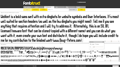
My "WebFont" has finally been ironed out so that it will install.  It is free, obviously you can use it on your website as a web font (#webfont), and has lots of little dingbat extras for UI symbols. It is a bold sans serif with some goth touches, intended for logos and section headers with very good ledgibility (or readability).

Today, I updated the following characters: / | \ & @ % ^ ( ) - + = : ; ' " n t m, still mulling over other changes. Anyways, I am still working on it, so updates may yet be forthcoming.  It has become apparent that I need to update a lot of the punctuation, I have a new style that needs to be applied to the other quotes, commas, semicolons, etc.  Always something.  But, it's getting there.

https://w3n.us/wf
"WebFont" a free bold sans serif with goth cuts & a few extra dingbats.
The development version is available at Fontstruct, the free online font editor.
This font is a good basic start for your own take, and is eligible for designing your own 'derivatives' (edited, modified, appended or stylized renamed copies based on the original font), so if you like it and you want to tweak it, feel free to go ahead and do just that.  You can clone it at Fontstruct and edit it there, or you can download it from Font-Journal (or FontStruct, but the official download distribution release is at my own site archive of fonts, Font-Journal {unless Google Fonts would ever want that job}) and then throw it into your favorite font editor.  I would hope to be acknowledged for my contributions to the finished font in the documentation.  Just be sure to rename this font, as it one uses the reserved name, "WebFont", and yours can't as well, or we would have too many fonts named the same thing.

WebFont is a modular font, which also means that it is well optimized for Flash, if you are still using that in, say, an animation video production environment.  I made the following preview image using a free metal background I grabbed from Graphic Flip...

WebFont Character Preview (limited number of characters displayed).
WebFont has an official distribution release version home page at Font-Journal
Now, please be assured that I am going to keep working on this, that it will improve over time.  That said, I may not be back here to officially announce a new version the next time it is updated, but I will come back and update this blog entry with updates when I can.

Currently, WebFont offers 611 glyphs and still is a very light load. Google Fonts requires 213 particular glyphs, and all of those are present, while supporting Basic Latin, Latin-1 Supplement, Latin Extended A, General Punctuation, Superscript & Subscript letterset registers, as well as the Copyright, (Registered) Trademark, Service Mark, TEL and FAX Letterlike Symbols, a few Currency Symbols, and a wide variety of Dingbats.  I have started the Latin Extended B letterset register, but have a long way to go on that one.  

Thanks for taking the time to check out my work.  Font-Journal is where I keep my officially released fonts, but it is also an archive of what I feel are great freeware and shareware fonts.  I try to post anything there that I can redistribute, especially stuff that I can use on websites (web fonts / #webfonts) and that are good for commercial projects such as logos.

Speaking of logos, I have to get back to one right now and will be back to publish this once I have the official distribution release archive ready to download.  ;)  See Ya!

 -DP
Dougs.Work
Doug-Peters.com
HDWebHosting.com  
DomainHostmaster.com
Salamander.US
W3DN.com

Friday, March 16, 2018

Xwept Fonts - 3 CC0 Freeware Fonts

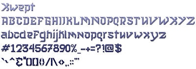
I was quite surprised to find that a client for whom I am creating a logo chose the logo rendition (that I almost didn't even include) with my own font, Xwept.

I released this as a freeware (Creative Commons 0 - Copyright credit maintained free for Personal Use without any other restriction than it and all derivatives must remain under the same CC0 license) font some time ago, but no one really seemed too interested in it.  However, as unique styles go, this font seemed to fit the needs of his logo, specifically.  I even created a more muted version of the first Xwept font in order to find a good complementary font for the second line of text.

https://w3n.us/xwept

https://w3n.us/xwept

https://w3n.us/xwept


The original font is actually Xwept Small, named as such because of the smaller loops, ascenders and case style found in the lowercase a, b, d, e, g, i, j, k, m, n & t letters.  Eventually, I will change a few more of the lowercase letters, trying to compact them vertically.

I can remember David Carson asking me if I had any new crazy fonts.  He liked to use them when he was the art director for Ray Gun Magazine so that reading his Rock 'n Roll articles were an adventure.  I had no idea I'd fall in love with creating these fonts, myself.

But I also knew that I had to make the necessary corrections required for most everyone else (mainstream public and media).  Otherwise, my unique fonts aren't even going to get a second look.  After all, I would like to fit in and contribute to society, somewhere, somehow.  

So a more tamed version of Xwept was created.  And it did look good as the top line of my client's logo, but it still needed to be toned down and given a uniqueness of its own for the next couple lines of text, which was more descriptive and less logo-ish, it needed to be more legible (unless of course, you are an alien).  

So, because I could not find a font that complemented Xwept without over-powering it, or just being too lame, I created Xwept Plain Spoken for Common Folk, which offers its own unique flair but still works with Xwept.

I am going to update that font further, as well, and introduce the theme of the font to more of the characters.  In this case I will see it as an improvement, so it will be the same crazy font name, Xwept Plain Spoken for Common Folk, but a new version to overwrite this first one.  So, if you like it, grab it now.  ;)

Saturday, March 10, 2018

Bevelry (Optical Illusion) Fonts & Medieval Hrunting Staff Font

Hi guys...

2017 was a tough year for me.  I had absolutely no posts here on this blog in 2017 because I was always fighting my aging computers.  After my last reliable computer, a Sony VAIO laptop finished my last Christmas card on Christmas Eve of 2017, it pooped out on me.  Fortunately, after 2 months of waiting, I managed to fanagle a new Dell Inspiron 15 5000 Gaming series 7755.  After 5 PCs have gone out of commission, finally, I'm back!

I apologize about the absense.  Hopefully, my new Dell laptop will keep me on track, now.

Just in case anyone is wondering, the URL shortener I use in these posts is mine. At one time it was public, but then it was getting spammed, so I locked it down. https:// will work with all the addresses, and usually I try to add the 's' at the end of the http but I know I must forget a lot, too.

Anyhow, I am the only one using it. Some of the commercial fonts are actually long ass affiliate links. If you don't like that, you can go to the domain and find them yourself.

I also run www.Font-Journal.com (which is not yet https enabled because of the server I have it on now), and I just added a couple of fonts that I helped touch. That is, they were Creative Commons Attribution Share Alike licensed fonts and so I made a couple of derivatives.

https://w3n.us/bevelry
The original font didn't have any lowercase characters, so I added them. This is a shadow font that plays a trick with the eye to show a beveled serif font.

-I have added 2 more improved versions of this font to the distribution archive for a total of 3 fonts.

Font-Journal.com


https://w3n.us/hruntingstaff
Hrunting Staff is an old style rough blackletter with a staff running through the capital characters. The name comes from a tribe that inspired the original font.

-I will be posting the original version to this olde style font after a few more tweaks.  Remember, I am just getting back online and I have a lot of software to install on my new Dell laptop.

Even with all the computer problems, I had been posting a few freeware fonts that were commercial use ready each month, until January and February of this year (2018), when I was completely void of a real PC that could accomplish my tasks as required.  Needless to say, there are a lot of fonts at the Font-Journal.

As always, all the fonts on Font-Journal are available for free download. The original catalog included shareware, as well as lots of freeware. I have been trying to reclassify the the ones marked "free for personal use" that are actually full legit freeware, but the catalog is big.

As mentioned, since I am an artist and designer, I have been adding to the already large font catalog, and I have tried to showcase freeware fonts that are OK to use for commercial project use.  Remember that even some of the freeware do require attribution, as well (a credit for their contribution to your overall design and vision is customary, especially in professional works).  There are also still a few shareware added, some of which I cannot seem to register (maybe the designer has moved on to a better place?).  Of course, there are some shareware fonts that is really too good not to include in the archive.

When I make a font, I am usually using free tools. Although, I have finally grabbed a little font editor program, I never seem to open it. I prefer creating a character in a large canvas space. So I create stuff using tools I have found online, and some of these tools come and go, or become paid subscription sites. When they do, I move on.

I am a brand nut. I design logos, full identity packages, graphics, websites, marketing, ads... I also design and build PCs, and fix 'em for others, and in order to make sure I had control over my domains, brands and websites, I partnered with major technology companies so that I could offer my clientele and customers the very best products and vital business internet services with dedicated support teams, and then offered them to my fellow pros at the very best prices, all with less cross-selling (web spam) and virtually no email marketing (spam).

I have a lot of friends and fellow professionals using my services and quite happy with them. But, I try to offer the best solution to each professional or company based on their needs. That means, I am not going to post a bunch of my links to all my domain registration and web hosting/server solution offers in this post. But, if you would like to talk to me about what I can do for you, reply to me and I'll see if I can contact you somehow, privately (if I can).

Tuesday, October 18, 2016

Updated Font: SDSU Collegiate

Updated Freeware Black/Heavy Slab Display Caps PC & Web Font: SDSU Collegiate


SDSU Collegiate Font Download Page

As this font has become a popular downloaded freeware TTF PC & web font at Font-Journal.com, I decided that I needed to update it.  In the above example graphic, the older character set is used, which I created in 2104.  

This is a black or heavy slab font that lends itself well to collegiate sports, such as football and basketball (etc...) jersey lettering and numbers.  This is why the font specifically did not have any extra punctuation in the first place.  

This font easily reproduces the SDSU printed logo used widely on sports gear.  To recreate the SDSU logo, you must use the lowercase set of capitals in a deep blue, with a yellow outline (the school colors).  Of course, there are a number of variations on that theme, too.

SDSU is the home of the Jackrabbits and have been well known for their basketball teams, but their football program and other sports are extremely competitive, as well (a bit more on that, later..).

Once that SDSU Collegiate showed-up on Font Journal's 'most downloaded' list, I decided that for the convenience of anyone wanting to use the font for more, I would include a basic punctuation and symbols set.  

The font's original character set is given again below (old version, then updated), for comparison...


I never would've dreamt that this display caps font would become so popular.  But it has (at least on my site), so I decided I needed to update the font so that it included a more complete character set to support the basic English language with more punctuation, because I don't want to make using it rough on anyone...

SDSU Collegiate Font Download Page

The original font was created on March 20th, 2014.  I finished updating it with punctuation and symbols on October 6th, 2016.  I have also now expressly given my permission to use this font online on your website or blog as a free web font with this update, especially now that there is punctuation available.  My guess is that most might just be using it for sports jerseys?

This is also a modular font.  If it matters, modular fonts are optimized for Flash, but Flash seems to losing support on the web, though I am sure it must be used in professional animation and video production, still.

As noted, this font, SDSU Collegiate, was originally inspired by the SDSU logo on South Dakota State University jerseys and school booster wear & gear.  This update is publicly released on Font Journal on October 18th, 2016, to celebrate the SDSU Jackrabbits winning the Dakota Marker football game against number 1 ranked NCAA Division 1 FCS team North Dakota State University (the NDSU Bison) on Saturday, October 15th, 2016.

This game's trophy is a stone marker that was once used to mark the dividing border between South and North Dakota, and at least to the two schools (SDSU & NDSU), it really is a big deal.  It's been a long time since SDSU brought that marker home and we are quite proud to have it.

As I have said, I had no idea that so many would download this font, and so this update was merely for the convenience of the users of the font.  Below is a complete look at all the supported characters in the SDSU Collegiate TTF PC & web font:


SDSU Collegiate Font Download Page
While the newly updated font character set pretty much stays true to the original font and simply adds punctuation, as I looked at the character set above I wanted to make a few improvements.

But as the font had already proven itself as a popular download, I decided to make another version of the font and work on the changes I was thinking of, there.  So I wound-up creating "SDSU Collegiate V2", and then I made another, "SDSU Collegiate V2 Extended".   I will be introducing these fonts here on my blog soon, once I get the distribution archive text files buttoned-up, the archives zipped-up, and then the distribution archives uploaded to Font-Journal.com.

LOL... as soon as I am done with this post, Blogger refuses to act nice and save it.  There is so much to be said about hosting your own blog/website.

Tuesday, October 11, 2016

Modmin Commercial Use Friendly CC Freeware Font

Modmin is a freeware TTF PC and web font Copyright Doug Peters, 2016.


Modmin Creative Commons Freeware Font


Resource LINK:
http://www.font-journal.com/fonts/13350/modmin.php


The font portrayed, included in the distribution archive available for download at the Font-Journal resource link designated, uses reserved name 'Modmin' (filename: "Modmin.ttf"), was created by Doug Peters and was released initially as version 1.0 on October 11th, 2016 as a freeware font under the Creative Commons Attribution-ShareAlike 4.0 International (CC BY-SA 4.0) License.


About Modmin:
Modmin is a MODular TTF web font that uses a MINimum of basic latin characters to reduce the overall load of a website.  It was inspired by  the look of older retro machine generated script fonts such as seen in some older word processors and printers.

This font provides a complete capital character set, a complete lowercase character, 0-9 numerals, and it offers a standard set of punctuation characters, plus the TM, Registered Trademark, and Copyright symbols.

This font is a modular font, which also means that it is optimized for Flash.

As a quick synopsis, the font in the distribution archive is free to use for personal, commercial or non-profit projects as the author has released it as a commercial friendly freeware font, and you may even redistribute the fonts as long as credit is given to the original artist/designer for his part in this free culture work, but you may not charge for access to it or otherwise sell it, since as a free work, the font it is intended to remain free to everyone.  If you edit, append, convert or otherwise modify it, please note your contributions to the font in the original documentation and always redistribute it with all documentation together under the same CC BY-SA 4.0 (Creative Commons Attribution-ShareAlike 4.0 International) License.  For specific details on the license, see the "Modmin License.txt" text document included with the archive, or visit one of the following Creative Commons links, as is appropriate for your needs...

CC BY-SA 4.0 License Legal Code:
https://creativecommons.org/licenses/by-sa/4.0/legalcode

CC BY-SA 4.0 License Summary:
https://creativecommons.org/licenses/by-sa/4.0/

Technical Issues - Please Stand By...

It has been a while since I've been able to create and post an original font of my own, on my own cataloged freeware and shareware digital font repository, Font-Journal.com


The main issue is that I have had some technical problems, like PC and smart phone issues.

  1. First, I upgraded from a Samsung Galaxy Note 2 to a Note 7, and that experience has not been a good one.  Although I was able to check-out the Apple iPhone 6S Plus as a loaner while I awaited my Galaxy Note 7 replacement, I spent almost all of my time configuring 3 different phones over a month and a half.  Once I finally received the new replacement version of the Note 7 and I have finally configured it (and purchased all sorts of accessories like a wireless charger, 2 cases and more crap for it), all the sudden Samsung wants these things back.  Holy crap, when will I ever stop shopping for a replacement phone and when will I ever get all the settings right, again?
  2. Right after I pre-ordered the Note 7 (as soon as I possibly could), my Note 2 died that very weekend.  And immediately after that weekend, my Sony High Definition Laptop stopped powering up.  The issue is either bad ram or a bad SSD, but it was cheaper for me to buy a $200 used Gateway i3 laptop at my local used PC store (Heartland Computers) than try to fix the old Sony (though I will if I don't find anything better real quickly).
  3. As I had a business cellphone that I could use, I upgraded that line to a Samsung Galaxy CORE Prime.  But, of course, getting that phone kept my nose pointed to the screen until the Note 7 arrived in the mail, because I had to get that one set-up and configured for work.
I've still had access to the online world through android tablets, an iPad, and by borrowing my wife's Dell laptop, but not the always-on-line with 24 hour anytime access using a fully functional and well configured laptop complete with all of my software, as I once had.

Luckily, I am finally getting this dented little old Gateway laptop setup and configured with the proper software and settings and have finally been able to create a few new fonts.  

I apologize for the delay, though I am sure that there is no one counting on me, or them, as I still haven't been able to afford a license for Fontographer, yet, and have been left up to my own list of free online font creation tools for the moment.

But that said, I have been able to finally take a breather and relax, and even play in FontStruct some.  To that end, I have updated 1 font, 'SDSU Collegiate' and created 2 additional versions of that font family, as well as created a new font.  

I plan on posting an announcement for the new font, Modmin, here that will allow a decent preview of the new font, which I have already uploaded to Font-Journal.

Then, I have to blog about the infuriating issues I have with Samsung over at www.Handheld.Tools, if for nothing else, just to get that off my chest (you have no idea).  Then, in the coming days, I plan to upload the updated 'SDSU Collegiate' font and font family archives to Font-Journal, and then I will announce them here, as well.


But, I am getting these issues resolved one by one, and getting back on track again.  Please bear with me.

Friday, September 30, 2016

Getting Back Into The Swing Of Things

I've been sort of disabled in the past.  In August, my Sony Vaio (updated with Windows 7) went flaky and wouldn't start-up.  It may only be the SSD drive, or it also could be the RAM, but replacing both to get running again was about the price of getting a used laptop with a better processesor.

So, that's what I did, I saved a bit and grabbed an old laptop so that I have something that works, for now.  I have an old Gateway with a Core i3-350M processor (an upgrade from my Vaio's Core Duo).

I managed to get quite a few fonts added to the Font-Journal.com catagorized PC TTF font repository website in August, before this issue, but experienced the problems before mid month and didn't actually pick-out this used Gateway until a week ago.  So I kind of had to scramble to get the Windows 7 updates loaded, my software installed, basic settings configured and upload a few fonts this last month (September) before it was over.

Welcome, October!  I plan on getting more fonts online this month, though it may be at a slower pace than normal since I had to acquire some extra work in order to afford a new old laptop (along with the Note7 I bought, returned and grabbed an iPhone on loaner, then returned that once the new Galaxy Note 7's were in.

Hopefully I will find a period of less stressful technology for a few months and I can get back on track, once I am caught-up with everything else I'm doing.

As I have been so very busy with all these and other technology SNAFUs, I haven't been able to keep this blog as updated as I have previously.  And maybe showing the very same preview that's available on the font-Journal website isn't as cool as doing something different (and hopefully, better).

So I hope to do more updates and announcements of what's happening in the journal posted here in the blog, soon.  But in the meantime, I am trying to get Font-Journal.com updated.

Wish me luck!

Monday, September 7, 2015

Font-Journal: Exclusive Original Fonts and Site Update

As many of you know, I am the fontmaster at Font-Journal.  Over the past year I have been pretty busy trying to save my work from disappearing completely.  I create a lot of freeware (and some shareware) graphics, website templates and fonts.  But, a rash of hard disk drive errors over the past year has thrown me for a loop.

A year ago, I had to recover from my first hard disk drive crash.  Although devastating, I seemed to be able to recover almost everything from backups on an external hard drive.  I even purchased a network attached storage drive device to help automate the backup process.

But six months afterwards (just over six months ago), the 1 TB hybrid 2.5" Seagate SSHD I used to replace the old failed Seagate 750 GB hard drive that crashed, failed without warning in a very hard crash.  Seagate has already replaced the hybrid drive that failed (as it was still under warranty), but I am still digging through old SDCards, MicroSDCards, Memory Stricks, Compact Flash, Flash Jump Drives and external hard drives trying to recover my files and data.  You see, I could never get that WD My Cloud NAS (newtwork attached storage) drive device to work right.

There was no way to recover the Seagate files and data.  I used all sorts of tools carefully trying to recover my data.  I even considered using a forensics lab to recover my work.  But I knew that I had just about everything up to 6, or now 7 months ago.

I am missing all of my font projects, but I do have all of my last distributed freeware/shareware font projects.  I am missing some photos and video here and there, but have most of it.  Some of my older video is missing the audio, though.

As for the rest, I am missing the work I did on websites and graphics for that 6 month time frame.  I seem to have all my music, though.

Losing my font and art projects was kind of a blow, though.  I had some pretty important (to me) projects that were much further along.  Now I have to restart them.

I now have the WD My Cloud NAS drive device working, but it is completely unreliable.  A tech walked me through recovering it and resetting it to factory specs, but it still falls off the network.  I added two USB 3 hard drives to the router, but I cannot access them through the network (I will be calling the tech about the new AC router, as well).

Clearly, technology isn't improving.  It is breaking easier and more quickly.  Heck, none of this stuff is even making it to the warranty expiration period.  And if a product is replaced, you get someone else's repaired device that some tech may or may not have fixed (and usually not, these things usually have multiple issues and the tech only addressed one because of time quotas on the job).

I laid-out some extra bucks for a 500 GB Samsung SSD 850 Pro.  I have spent 6 of the past 7 months recovering files.  I have setup backup options that still aren't working because of hardware and/or software failures.  I am completely exhausted from reorganizing my files, backing up files and images, yet it is NOT even done until I have a NAS solution that works.

In the past 3 months I quit my regular 'part time' job in order to attend more to my website and graphic design venture.  Which, of course, was complicated by all these hard drive failures.  So, I am busy just trying to get a little work together so that I can put some meat on the table every once in a while.

However, I have been trying to keep the Font-Journal updated with new fonts.  Lately, I have been adding a lot of web fonts that are ok for commercial use from Vernon Adams (view the entire catalog of available Vernon Adam fonts available at Font-Journal).  I do have more to add, and I will be doing so as time permits.  There are a few freeware fonts that are OK for commercial use by other designers, too.

I am also interested in starting some new font projects.  I am actually looking into doing some more professional freeware web fonts (OK for commercial use) that I will distribute exclusively through the Font-Journal PC TrueType font repository and catalog.  However, in order to do so, I have to look into crowd funding of the project, because now my spare time is getting scarce.  Let me know if you are interested.  I will detail possible projects in a few posts at a later date.

Font-Journal already does have some freeware fonts that I created which are distributed exclusively through the Font-Journal.com website.  But I am looking to sort of grow my personal font creations catalog into a font foundry of my own like Ray Larabie or Vernon Adams.  In order to do that, I need more professional software than the free tools I have been using.

I have already purchased some Fontlab products and I am looking to get a more professional editor now, like Fontographer.  I have already produced some freeware fonts, and my catalog is available at http://www.font-journal.com/search.php?q=Doug+Peters

But I will have to use crowd funding in order to do more projects.  Still, as I have been using free tools online previously, the quality of my typography definitely suffers due to the limitations of these free tools.  Is my portfolio even good enough to ask for crowd source funding, now that I have lost my last few projects that I was hoping would put me over the top?

Let me know, guys and gals.  Thanks!

Sunday, May 4, 2014

Too Much Fun

I indicated that I will be updating this blog with posts showing off my own font creations that I have made.  I do love to blog, but as I have so little spare time, I find that I prefer to spend it designing logos, menus, websites and fonts.

I now have a long list of fonts that I am working on.  Once in a while, if truly inspired with a simple design, I can create a simple, basic font with a pretty full character set in just a day.  But then, I have to document it. I write about how I made the font, what may have inspired it, any little challenges on the way.  I then add an appropriate license, trying to get the wording right right so that it is clear and easily understood.  I also make a couple of graphics.  One with the full character set, one just as a preview of what the font is capable of doing.  After a few rewrites, and sometimes a few font edits after checking it out in Photoshop, I'm done, but packaging-up a font really adds a whole 'nother day to the process.  Then I can upload it to my Font-Journal.

Once it is available at Font-Journal, I have to check it out and make sure it displays, that at least most of the characters in the preview page actually display.  Then, I have to edit it and add a couple of links to the font info page.  Sometimes I can approve it before I edit its information, but usually I wait until everything looks good and then go ahead and approve it in my administration control panel so that everyone else can see it.

Supposedly, I should then announce it in a few places the next day (in a couple of Twitter feeds, other social networks  like Facebook, BeHance, LinkedIn, WordPress, Blogger) and then I am done for the moment.

The thing is that I would rather be creating stuff than promoting it.  So I'm not marketing my stuff much, because I have more fun creating it.

I also have lots of other stuff going on, mind you.  Right now I am trying to recover my wife's laptop, and trying to get my son to get his homework done.  So there are always little things keeping me from what I ant to do, what I should be doing.

There is the problem that not many believe in Me the way I do.  Oh well.

But, rather than have you all wait for a post about each font that I have made in the past year, I'll just give you the link to the fonts I have already uploaded to Font-Journal: 

http://www.font-journal.com/search.php?d=1&q=Doug+Peters

Don't get me wrong, I will get around to posting little preview articles about most of my decent fonts, anyway.  But I am have way too much fun creating these fonts at the moment.  And I am actually excited to get these out and available to the public.

My fonts aren't usually met with the warmest receptions, as I like some obviously quirky styles.  But hey, they are freeware TTF PC fonts.  Although the license varies from font to font, I generally try to keep them free for personal, public or commercial use.

With some fonts I allow others to make their own derivatives, and yet with some fonts I want to be the exclusive developer.  With some fonts I allow redistribution.  With other fonts my Font-Journal will be the exclusive font archive distribution center.

So, please read the associated ReadMe.txt and License.txt included with each font archive.  I will protect my  intellectual property and all my rights to it (as that's all an artist ever has).  After all, I want to keep creating more art, and for my art to spread and influence the world as it has Me.  I sure as heck don't want to spend my time in the courts (but I will if I have to).

So, just pay attention to the license and we will both be happier, ok?  ;)

Thanks!  (Back to having too muck fun!...) -Doug

Thursday, April 17, 2014

Struck Freeware TTF Font

Struck is a freeware TrueType font for the PC I did.  The font Struck is Copyright 2013 Douglas Peters.


You are allowed to use the Struck font as-is for free for personal, professional and commercial use.  However, you may not modify, append or change the font other than porting the font over to another platform, such as the Macintosh.  No further distribution, or redistribution is allowed, as it is available officially from the author at:
http://www.font-journal.com/fonts/13104/struck.php

The only other online archive is intended for development purposes.

Struck was the second font that I had ever created.

This is a black sans serif minimalistic block font with a couple of repeating themes in the ends and such. I consider this freeware, but maintain my copyright and only allow distribution through FontStruct and my own journaled catalog of freeware fonts (@ font-journal.com).

Struck was created on Monday, the 22nd of July, 2013.

August 2-3, 2013:
Added the trade/service marks, TEL symbol, a few more currency signs and revamped many of the characters. The old K was cute, but I decided to opt with a style that would allow more consistent spacing.  I did make certain letters a bit more whimsical in an effort to keep that feeling.

I think this version has a more complete character set, but it is still kept basic to allow for fast downloads and low memory usage.  But if you are interested in seeing any particular character, or would like to see one corrected, get  a hold of me.  ;)

August 4th, 2013:
That small s was bothering Me all night at work.  It was the one thing I didn't get done right.  Taken care of, today.

Below is a simple example of the Struck character set:


The replacement characters exist as my logos (the joined DP, presented in the style of the font).

I hope it can be of use to some of you.  And again, I will consider requests for special characters.

My website:
http://www.Doug-Peters.com

My fonts portfolio:
http://www.font-journal.com/search.php?q=Doug+Peters

Contact me:
http://www.doug-peters.com/contact/
http://www.font-journal.com/contact.php

My business website (I sell the most competitively priced domains and hosting/servers on the net):
http://www.DomainHostmaster.com