Search FontMaster

Showing posts with label free fonts. Show all posts

Tuesday, January 29, 2019

Free Mohave Sans OFL Font & Web Font by Gumpita Rahayu & Tokotype

Mohave by Gumpita Rahayu & Tokotype

#Sans Serif #Typeface with a 4 Weight #FontFamily offering Regular & Italic styles (8 #Fonts).
 
https://w3n.us/mohave
 
OFL Freeware #Font#Family

About the Mohave font (as posted at the destination website):
------------
"Mohave is a titling display sans serif typeface, built with smooth height and dynamic glyph. It's designed for large points setting and contains four weights with each letterform is nearly monolinear, with fewer corrections applied to stroke and joints to maintain the typefaces structure remain visible.
https://w3n.us/mohave
 
"Initially designed by Gumpita Rahayu. as all-caps display fonts in 2013, it was expanded into a 4 weights family including matched italic in 2018. The new version has new body shapes, with more neutral and modulated forms, including some alternates in the uppercase and lowercase and equipped with OpenType Pro encoding."
------------
https://w3n.us/mohave

Download #Free from Fontesk...
https://w3n.us/mohave

Friday, March 16, 2018

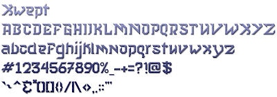
Xwept Fonts - 3 CC0 Freeware Fonts

I was quite surprised to find that a client for whom I am creating a logo chose the logo rendition (that I almost didn't even include) with my own font, Xwept.

I released this as a freeware (Creative Commons 0 - Copyright credit maintained free for Personal Use without any other restriction than it and all derivatives must remain under the same CC0 license) font some time ago, but no one really seemed too interested in it.  However, as unique styles go, this font seemed to fit the needs of his logo, specifically.  I even created a more muted version of the first Xwept font in order to find a good complementary font for the second line of text.

https://w3n.us/xwept

https://w3n.us/xwept

https://w3n.us/xwept


The original font is actually Xwept Small, named as such because of the smaller loops, ascenders and case style found in the lowercase a, b, d, e, g, i, j, k, m, n & t letters.  Eventually, I will change a few more of the lowercase letters, trying to compact them vertically.

I can remember David Carson asking me if I had any new crazy fonts.  He liked to use them when he was the art director for Ray Gun Magazine so that reading his Rock 'n Roll articles were an adventure.  I had no idea I'd fall in love with creating these fonts, myself.

But I also knew that I had to make the necessary corrections required for most everyone else (mainstream public and media).  Otherwise, my unique fonts aren't even going to get a second look.  After all, I would like to fit in and contribute to society, somewhere, somehow.  

So a more tamed version of Xwept was created.  And it did look good as the top line of my client's logo, but it still needed to be toned down and given a uniqueness of its own for the next couple lines of text, which was more descriptive and less logo-ish, it needed to be more legible (unless of course, you are an alien).  

So, because I could not find a font that complemented Xwept without over-powering it, or just being too lame, I created Xwept Plain Spoken for Common Folk, which offers its own unique flair but still works with Xwept.

I am going to update that font further, as well, and introduce the theme of the font to more of the characters.  In this case I will see it as an improvement, so it will be the same crazy font name, Xwept Plain Spoken for Common Folk, but a new version to overwrite this first one.  So, if you like it, grab it now.  ;)

Sunday, March 11, 2018

My Font Groups/Communities...

One of the things that is hard for me is the promotion.  Sure, I can add design my own fonts, search for good ones that are OK for commercial use online, create more refined documentation for each new distribution archive, and add them to Font-Journal, but if I don't tell anyone, no one is going to check them out.

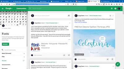
This blog is only one means of promoting good freeware and free commercial fonts, and last year I spent more time trying to recover data from hard drivers than I did working.  So, I haven't been around much, but I have been adding fonts and sharing the leads I get on good free commercial fonts in my Facebook group, "Digital Fonts", and on Google+ communities, "Fonts".

Digital Fonts Group on Facebook

 Fonts


Remember also, that I'm a poor (fat, old) artist wanna-be that makes a meager living off the internet trying to sell fresh logo/graphic/website designs and branding packages, domain registration and hosting services, encrypted servers, webmaster tools, custom built PCs, upgraded Macs, tech support, video production services, T-shirts, and also offer a smattering of really well researched affiliate links.

But the point is that I haven't actually been making a real living here, which is why I haven't had a capable design & video production laptop computer for the past 2 months.  But now that my PC issues have been addressed, I really need to ramp up the promotions, because I need to find a way to make a living on the internet.  No one wants to hire an old, fat, crippled designer that is just one class short of his Bachelor of Fine Arts Degree, who holds onto illusions of grandeur by harboring dreams of becoming a famous artist one day.

But here is where it hurts, although I have always been an ad man, enjoyed marketing, personas and studied brands in great detail, I still harbor great dread of becoming a worthless scumbag spammer, even if by accident.  And if you don't know what you are doing, that is the easy road to take, a mistake that may never be rectified.

While I do know what I am doing, I haven't ever made the effort I should because I hate spam, and I am working in the online medium where quite frankly, spam dominates the world by using tricks, deception, propaganda and curates messages of hopelessness.

But whether or not I like it, I have to do more promotion.  Still, people could make my job easier by joining one of the two groups I have setup on Google+ or Facebook.

Originally, both groups were called "Fonts" but I changed the one at Facebook to "Digital Fonts" in order to secure a custom URL I seem to have forgotten.  But I use the short links from my W3N.US site to get to each easily:

Google+ community: "Fonts" uses the short link: https://w3n.us/f0nts
Facebook group, "Digital Fonts" uses the short link:  https://w3n.us/fonts

Thanks for helping me out by joining one of the two groups above... sometimes just getting the works out there doesn't allow for the time required to promote and market it as well as I would like. Plus: clientele. deadlines. technology. You know the game, it's life.

Sunday, March 27, 2016

Capture It Family fonts by Magique Fonts

The Capture It Family contains both the 'Capture it' and 'Capture it 2' fonts by Koczman Bálint from Magique Fonts.

These are both free TrueType Stencil sans fonts, and you can see in the two previous posts here at FontMaster, the character preview map of each font in the archive.

Furthermore, when I do add Capture Smalls (also by Koczman Bálint), which will include the lowercase letterset, I will be adding it to this archive (as well as an archive for it on its own as it can stand on its own).

Although these are free TrueType fonts, the artist/designer does accept donations.  You can contact him through his Facebook page...

https://www.facebook.com/Magique-Fonts-Koczman-Bálint-110683665690882/