Search FontMaster

Tuesday, October 18, 2016

Updated Font: SDSU Collegiate

Updated Freeware Black/Heavy Slab Display Caps PC & Web Font: SDSU Collegiate


SDSU Collegiate Font Download Page

As this font has become a popular downloaded freeware TTF PC & web font at Font-Journal.com, I decided that I needed to update it.  In the above example graphic, the older character set is used, which I created in 2104.  

This is a black or heavy slab font that lends itself well to collegiate sports, such as football and basketball (etc...) jersey lettering and numbers.  This is why the font specifically did not have any extra punctuation in the first place.  

This font easily reproduces the SDSU printed logo used widely on sports gear.  To recreate the SDSU logo, you must use the lowercase set of capitals in a deep blue, with a yellow outline (the school colors).  Of course, there are a number of variations on that theme, too.

SDSU is the home of the Jackrabbits and have been well known for their basketball teams, but their football program and other sports are extremely competitive, as well (a bit more on that, later..).

Once that SDSU Collegiate showed-up on Font Journal's 'most downloaded' list, I decided that for the convenience of anyone wanting to use the font for more, I would include a basic punctuation and symbols set.  

The font's original character set is given again below (old version, then updated), for comparison...


I never would've dreamt that this display caps font would become so popular.  But it has (at least on my site), so I decided I needed to update the font so that it included a more complete character set to support the basic English language with more punctuation, because I don't want to make using it rough on anyone...

SDSU Collegiate Font Download Page

The original font was created on March 20th, 2014.  I finished updating it with punctuation and symbols on October 6th, 2016.  I have also now expressly given my permission to use this font online on your website or blog as a free web font with this update, especially now that there is punctuation available.  My guess is that most might just be using it for sports jerseys?

This is also a modular font.  If it matters, modular fonts are optimized for Flash, but Flash seems to losing support on the web, though I am sure it must be used in professional animation and video production, still.

As noted, this font, SDSU Collegiate, was originally inspired by the SDSU logo on South Dakota State University jerseys and school booster wear & gear.  This update is publicly released on Font Journal on October 18th, 2016, to celebrate the SDSU Jackrabbits winning the Dakota Marker football game against number 1 ranked NCAA Division 1 FCS team North Dakota State University (the NDSU Bison) on Saturday, October 15th, 2016.

This game's trophy is a stone marker that was once used to mark the dividing border between South and North Dakota, and at least to the two schools (SDSU & NDSU), it really is a big deal.  It's been a long time since SDSU brought that marker home and we are quite proud to have it.

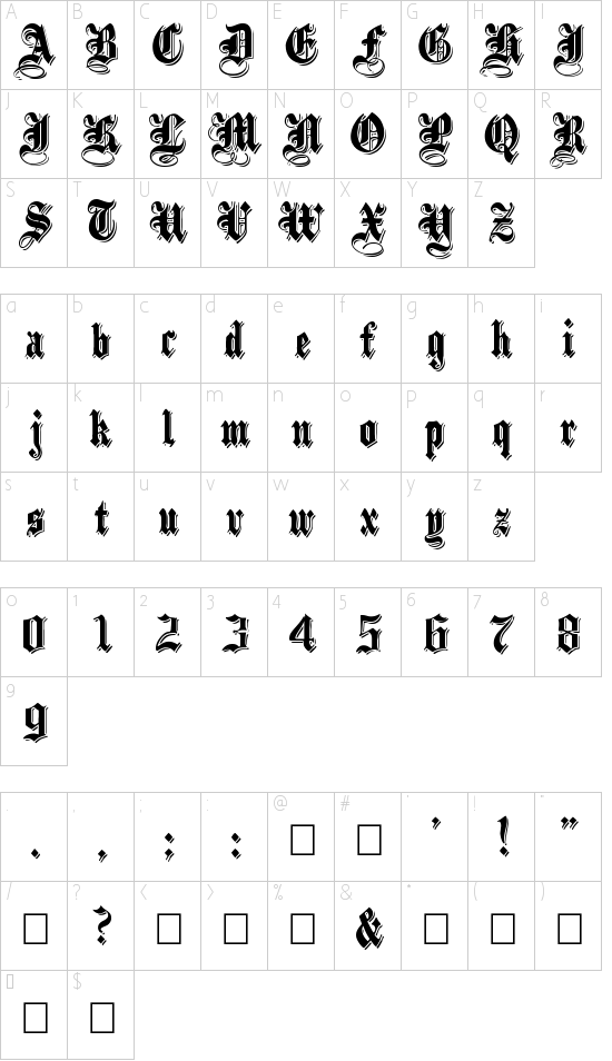
As I have said, I had no idea that so many would download this font, and so this update was merely for the convenience of the users of the font.  Below is a complete look at all the supported characters in the SDSU Collegiate TTF PC & web font:


SDSU Collegiate Font Download Page
While the newly updated font character set pretty much stays true to the original font and simply adds punctuation, as I looked at the character set above I wanted to make a few improvements.

But as the font had already proven itself as a popular download, I decided to make another version of the font and work on the changes I was thinking of, there.  So I wound-up creating "SDSU Collegiate V2", and then I made another, "SDSU Collegiate V2 Extended".   I will be introducing these fonts here on my blog soon, once I get the distribution archive text files buttoned-up, the archives zipped-up, and then the distribution archives uploaded to Font-Journal.com.

LOL... as soon as I am done with this post, Blogger refuses to act nice and save it.  There is so much to be said about hosting your own blog/website.

Tuesday, October 11, 2016

Modmin Commercial Use Friendly CC Freeware Font

Modmin is a freeware TTF PC and web font Copyright Doug Peters, 2016.


Modmin Creative Commons Freeware Font


Resource LINK:
http://www.font-journal.com/fonts/13350/modmin.php


The font portrayed, included in the distribution archive available for download at the Font-Journal resource link designated, uses reserved name 'Modmin' (filename: "Modmin.ttf"), was created by Doug Peters and was released initially as version 1.0 on October 11th, 2016 as a freeware font under the Creative Commons Attribution-ShareAlike 4.0 International (CC BY-SA 4.0) License.


About Modmin:
Modmin is a MODular TTF web font that uses a MINimum of basic latin characters to reduce the overall load of a website.  It was inspired by  the look of older retro machine generated script fonts such as seen in some older word processors and printers.

This font provides a complete capital character set, a complete lowercase character, 0-9 numerals, and it offers a standard set of punctuation characters, plus the TM, Registered Trademark, and Copyright symbols.

This font is a modular font, which also means that it is optimized for Flash.

As a quick synopsis, the font in the distribution archive is free to use for personal, commercial or non-profit projects as the author has released it as a commercial friendly freeware font, and you may even redistribute the fonts as long as credit is given to the original artist/designer for his part in this free culture work, but you may not charge for access to it or otherwise sell it, since as a free work, the font it is intended to remain free to everyone.  If you edit, append, convert or otherwise modify it, please note your contributions to the font in the original documentation and always redistribute it with all documentation together under the same CC BY-SA 4.0 (Creative Commons Attribution-ShareAlike 4.0 International) License.  For specific details on the license, see the "Modmin License.txt" text document included with the archive, or visit one of the following Creative Commons links, as is appropriate for your needs...

CC BY-SA 4.0 License Legal Code:
https://creativecommons.org/licenses/by-sa/4.0/legalcode

CC BY-SA 4.0 License Summary:
https://creativecommons.org/licenses/by-sa/4.0/

Technical Issues - Please Stand By...

It has been a while since I've been able to create and post an original font of my own, on my own cataloged freeware and shareware digital font repository, Font-Journal.com


The main issue is that I have had some technical problems, like PC and smart phone issues.

  1. First, I upgraded from a Samsung Galaxy Note 2 to a Note 7, and that experience has not been a good one.  Although I was able to check-out the Apple iPhone 6S Plus as a loaner while I awaited my Galaxy Note 7 replacement, I spent almost all of my time configuring 3 different phones over a month and a half.  Once I finally received the new replacement version of the Note 7 and I have finally configured it (and purchased all sorts of accessories like a wireless charger, 2 cases and more crap for it), all the sudden Samsung wants these things back.  Holy crap, when will I ever stop shopping for a replacement phone and when will I ever get all the settings right, again?
  2. Right after I pre-ordered the Note 7 (as soon as I possibly could), my Note 2 died that very weekend.  And immediately after that weekend, my Sony High Definition Laptop stopped powering up.  The issue is either bad ram or a bad SSD, but it was cheaper for me to buy a $200 used Gateway i3 laptop at my local used PC store (Heartland Computers) than try to fix the old Sony (though I will if I don't find anything better real quickly).
  3. As I had a business cellphone that I could use, I upgraded that line to a Samsung Galaxy CORE Prime.  But, of course, getting that phone kept my nose pointed to the screen until the Note 7 arrived in the mail, because I had to get that one set-up and configured for work.
I've still had access to the online world through android tablets, an iPad, and by borrowing my wife's Dell laptop, but not the always-on-line with 24 hour anytime access using a fully functional and well configured laptop complete with all of my software, as I once had.

Luckily, I am finally getting this dented little old Gateway laptop setup and configured with the proper software and settings and have finally been able to create a few new fonts.  

I apologize for the delay, though I am sure that there is no one counting on me, or them, as I still haven't been able to afford a license for Fontographer, yet, and have been left up to my own list of free online font creation tools for the moment.

But that said, I have been able to finally take a breather and relax, and even play in FontStruct some.  To that end, I have updated 1 font, 'SDSU Collegiate' and created 2 additional versions of that font family, as well as created a new font.  

I plan on posting an announcement for the new font, Modmin, here that will allow a decent preview of the new font, which I have already uploaded to Font-Journal.

Then, I have to blog about the infuriating issues I have with Samsung over at www.Handheld.Tools, if for nothing else, just to get that off my chest (you have no idea).  Then, in the coming days, I plan to upload the updated 'SDSU Collegiate' font and font family archives to Font-Journal, and then I will announce them here, as well.


But, I am getting these issues resolved one by one, and getting back on track again.  Please bear with me.

Friday, September 30, 2016

Getting Back Into The Swing Of Things

I've been sort of disabled in the past.  In August, my Sony Vaio (updated with Windows 7) went flaky and wouldn't start-up.  It may only be the SSD drive, or it also could be the RAM, but replacing both to get running again was about the price of getting a used laptop with a better processesor.

So, that's what I did, I saved a bit and grabbed an old laptop so that I have something that works, for now.  I have an old Gateway with a Core i3-350M processor (an upgrade from my Vaio's Core Duo).

I managed to get quite a few fonts added to the Font-Journal.com catagorized PC TTF font repository website in August, before this issue, but experienced the problems before mid month and didn't actually pick-out this used Gateway until a week ago.  So I kind of had to scramble to get the Windows 7 updates loaded, my software installed, basic settings configured and upload a few fonts this last month (September) before it was over.

Welcome, October!  I plan on getting more fonts online this month, though it may be at a slower pace than normal since I had to acquire some extra work in order to afford a new old laptop (along with the Note7 I bought, returned and grabbed an iPhone on loaner, then returned that once the new Galaxy Note 7's were in.

Hopefully I will find a period of less stressful technology for a few months and I can get back on track, once I am caught-up with everything else I'm doing.

As I have been so very busy with all these and other technology SNAFUs, I haven't been able to keep this blog as updated as I have previously.  And maybe showing the very same preview that's available on the font-Journal website isn't as cool as doing something different (and hopefully, better).

So I hope to do more updates and announcements of what's happening in the journal posted here in the blog, soon.  But in the meantime, I am trying to get Font-Journal.com updated.

Wish me luck!

Sunday, March 27, 2016

The definitive Blackletter: Black Family by Paul Lloyd

The Black Family is not only the definitive hand lettered medieval gothic calligraphy script, it's even a free TrueType font from Paul Lloyd!

This is one of Paul Lloyd's "Black Jewels", and I know that you are going to be impressed, take a look...

Embossed Black:


EmbossedBlack (there's also a Wide version)

Incised Black:


IncisedBlack (there's also a Wide version)

Plain Black:


PlainBlack (there's also a Wide version)

Shadowed Black:

ShadowedBlack (there's also a Wide version)

Each individual font is also be available separately (see the corresponding links under each character preview image).  So far, I have yet to get each of the Wide versions setup at Font-Journal, but I will be getting to it, with time.

So far, that is the original Black Family archive you could download from Paul.  But I decided to add one more font from Mr. Lloyd, the one he made to complete the set, UltraBlack Initials...


UltraBlack Initials:

UltraBlack Initials

Obviously, the UltraBlack Initials are an upper-case only blackletter font.  But if you are looking for the whole family, you may as well have the full family.

Paul Lloyd's work on these free Black Family fonts is exemplary and although I would tweak things a bit differently, I would be removing this font further away from its roots as a finely detailed handlettered manuscript font set.  Kinda hard to even believe that they are free.

Capture It Family fonts by Magique Fonts

The Capture It Family contains both the 'Capture it' and 'Capture it 2' fonts by Koczman Bálint from Magique Fonts.

These are both free TrueType Stencil sans fonts, and you can see in the two previous posts here at FontMaster, the character preview map of each font in the archive.

Furthermore, when I do add Capture Smalls (also by Koczman Bálint), which will include the lowercase letterset, I will be adding it to this archive (as well as an archive for it on its own as it can stand on its own).

Although these are free TrueType fonts, the artist/designer does accept donations.  You can contact him through his Facebook page...

https://www.facebook.com/Magique-Fonts-Koczman-Bálint-110683665690882/

Capture it 2 font by Koczman Bálint Updated

Capture it 2 has been updated to reflect its artist/author's new alias, Magique Fonts, and its free status.  The font designer/artist does take donations, though.

Capture it 2 font is the reverse of 'Capture it', giving a negative of the same very distressed all caps stencil style sans-serif font similar to something the military might use, with the same few differences in the style (The B lacks a Termination bar, the K is not distressed).

"Capture It 2" Free TrueType Font by Koczman Bálint

Updated "Capture it" Free PC TrueType Font

Capture it had previously been listed with a "Free for Personal Use" license at Font-Journal.  It's been updated to reflect that it is actually free, although the artist/designer, Koczman Bálint, who has changed his alias from Cpr.Sparhelt to Magique Fonts, is accepting donations.

Capture it is a very distressed all caps stencil style sans-serif font similar to something the military might use, though there are a few differences in the style (The B lacks a Termination post/bar, the K is not distressed).

'Capture it' free TrueType font by Koczman Bálint

Sunday, March 13, 2016

Rio Art Deco

Rio Art Deco is a big ugly black sans-serif drop caps font that has one panel decorated with an art deco pictograph.  This font only provides the two cases of capitals in the upper and lower case registers (no numerals or punctuation).

Rio Art Deco font is best used as a heading in art deco style promotional materials.

Rio Art Deco by Renn Crump from Font-Journal

Paintdrips

Paintdrips by Renn Crump is a free TrueType PC font that is OK for commercial use.  It would look appropriate in paint or painting service advertisements.

It is a drop-cap brush print with calligraphic touches, done a little sloppy (on purpose), in a heavy sans-serif that is dripping with paint.

The font offers 94 characters, including uppercase, lowercase, numerals and punctuation characters.

From Font-Journal

Meistersinger Family

Meistersinger Family free TrueType font archive offers a regular version, as well as a shadowed outline version of a very nice, curvy serif  typeface that shows elaborate flourishes on some of the serifs in the capital letters.

This is a nice set of a full font by Renn Crump.


LeGolf

LeGolf is a free and pretty full font that looks like it was inspired by bent, twisted and broken golf clubs.  LeGolf is another free font from Ren Crump.

Uppercase, lowercase and numerals, some punctuation.


LeGolf
LeGolf


LeGolf font distribution archive is available at Font-Journal and is OK for commercial use.


FARNOE INITIALS

FARNOE INITIALS

Free decoratively embellished unical style inital capitals uses celtic patterns to stand-out as a first letter or exotic heading.  Another free font by Renn Crumb.


Brought to you from Font-Journal, the freeware and shareware PC fonts archive & repository.

Architext

Architext is by S.G. Moye and has been released into the Public Domain.

I have updated the info on it (author, Public Domain), and added a text file to communicate its status and origination.

This TrueType PC font is a light drop cap sans serif minimalistic architectural style font with rounded terminators and angled curves.  Full font (uppercase, lowercase, numbers and punctuation).


Brought to you for Font-Journal, a freeware & shareware archive of TrueType fonts.


Saturday, March 12, 2016

Assimilate

Assimilate has been updated to reflect it's true license as a free font, and its origin as having been created by Jörgen Jörälv, Ultraboy.

From Font-Journal

Argosy

Argosy has been updated in Font-Journal to reflect its artist, Daniel Zadorozny, from Iconian Fonts.

Argosy from Font-Journal

Wednesday, March 2, 2016

Missing Blog Background

This is just one of my blogs that has lost its background.

I'm not sure what's going on, but I know of at least one other blog I have where this has happened.  I don't know if its my fault, or Google's or if I moved something in my Drive account, but I'll try to fix it.

RECTIFIED March 2nd, 2016 (Blogger's fault: Lost the default background image.  #SHEESH)